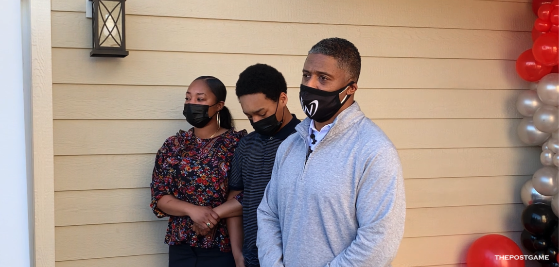
The people of Earth have pondered intriguing hypothetical questions for ages.
What if the British trumped the American colonies to halt a revolution? What if Henry Ford preferred kites to cars? What if Mexican fast food was made with real meat?
One hypothetical that probably didn’t need to be answered: What would NFL team jerseys look like if they were soccer jerseys (or kits, as the footie fans say)?
Someone went to the trouble of designing 11 teams’ possible soccer kits, and they did a freaking incredible job.
The obvious knock on soccer jerseys is the advertising that dominates the front of the shirt. It’s become commonplace in nearly every world league, and so fans sort of shrug it off. The sponsor is as much of a team’s identity in a single season as the color patterns and stripe design.
In American sports leagues that don’t include soccer, though, it’s sort of considered sacrilege. It takes a soccer fan’s perspective to look past the stigma of advertising in this case, and embrace the shirts for their seemingly flawless authenticity. The regional touch with each of the 11 teams’ sponsors almost makes the brand endearing. It may even make you want to buy the product more, which is sort of the point. And even though the project was clearly done for the fun of it, those brands are getting some free commercial space in
an extremely sharp presentation.
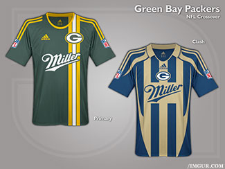
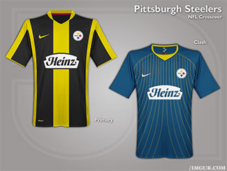
It’s fitting that on the week of the Super Bowl, the Green Bay and Pittsburgh kits are far and away the winners in this contest. The Miller brand label looks like it has always belonged on a Packer shirt, and the bold, solid striping of the Steelers’ home kit captures the city’s signature colors and attitude perfectly. The Atlanta kits come up just short of the first two, even with a modern twist. (It’s hard to beat a good kit with a faux sash,
though.)
There are some tricky color combinations in these NFL kits that you don’t see too often in soccer leagues, particularly the red, gold and white of the Chiefs. The effort is there in the design, but some colors just can’t be helped when thrown together. The home kit is nearly a dead ringer for the Arsenal home shirt, but with yellow thrown in. It should probably have been thrown out, much like any running back Kansas City started in front of Jamaal Charles over the previous two seasons.
The Browns’ orange and brown really only work on those classic football uniform templates, and even then it’s a stretch. The Patriots, Cowboys and Bills all fall in line with modern soccer looks, but fail to capture each team’s historic aura. That said, the effort on all of the jerseys is spectacular, and better than anything we could have drawn up. But it would have been cool to see the Cowboys with a kit reminiscent of the simple white that Real Madrid wears, or for the Patriots to vaguely resemble Liverpool FC, a club now owned by the Boston Red Sox ownership group.
But the only truly disappointing part is that whoever drew the kits up didn’t take more time to keep going. What would the Yankees look like as a football –- er, soccer -- team? And while we’re at it, how would you convert the Blackhawks’ look to baseball? Would the Heat look better if they looked more like the Dolphins. (Just ask Jackie Moon.)
Let’s hope this is only the beginning -- which is a phrase we’ve said about soccer for a long, long time.